Can Cheap Clothes Really Look Expensive? The Color Psychology Trick Stylists Don't Share
Why Do We Believe Price Equals Polish?
Most shoppers assume that expensive-looking outfits come from expensive price tags. That's the myth keeping your wardrobe stuck—and your wallet empty. The truth? Color does the heavy lifting. I've spent years on the sales floor at Nordstrom Rack watching customers walk right past gorgeous pieces because the color was "off," while grabbing basics that cost three times as much just because the shade looked "rich." Color psychology isn't marketing fluff—it's the invisible force that determines whether your $12 thrift find reads as designer or discount.
Here's what the fashion industry doesn't advertise: brands charge premiums for the same garment in different colors. That cream blouse costs more than the neon version not because of production costs, but because they've trained us to associate certain shades with luxury. The good news? Once you understand which colors signal quality, you can replicate that expensive aesthetic for a fraction of the price. No designer budget required—just strategic shade selection.
Which Colors Make Budget Pieces Look Designer?
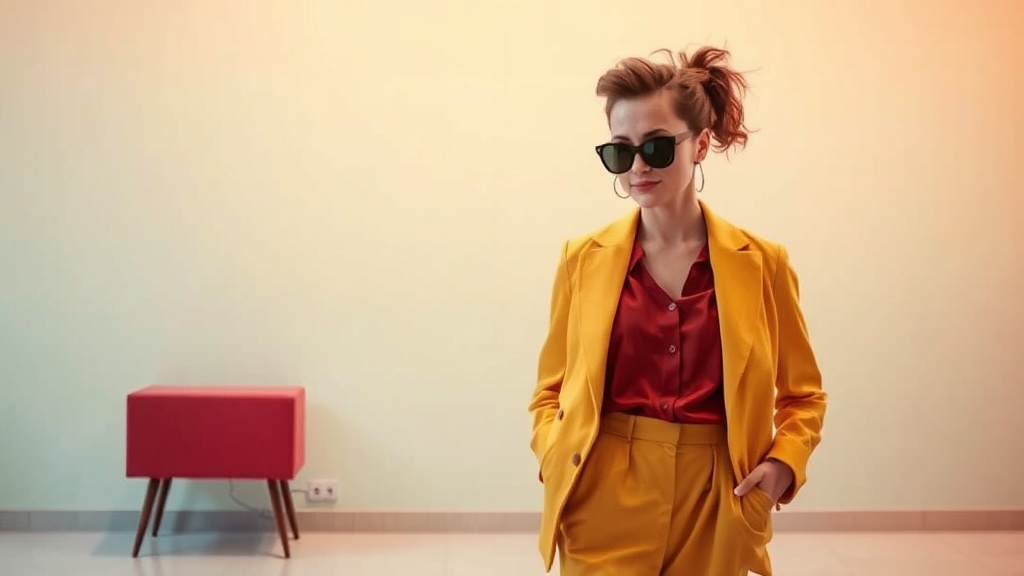
Deep, muted tones consistently outperform brights when you're working with lower price points. Navy outperforms royal blue. Camel reads richer than tan. Forest green elevates faster than kelly green. These shades mask construction imperfections, minimize cheap fabric sheen, and photograph beautifully—whether you're capturing an Instagram fit check or walking into a meeting.
The psychology is straightforward. Darker colors absorb light, creating a visual density that suggests weight and quality. Muted tones feel intentional and editorial. Bright, saturated colors demand perfect fabric quality to look expensive—cheap dyes in loud shades scream synthetic. When you shop budget, think jewel tones, earth tones, and deep neutrals. A $20 burgundy sweater will always outshine a $20 hot pink one.
Monochromatic dressing amplifies this effect. Wearing one color head-to-toe—whether that's all black, all chocolate brown, or all slate gray—creates an unbroken vertical line that looks expensive regardless of individual piece prices. It's the oldest stylist trick in the book, and it costs zero dollars to execute. Start with a base shade that flatters your skin tone, then layer different textures within that same color family.
What Color Combinations Read as Luxury?
Certain pairings signal sophistication instinctively. Navy and camel. Cream and chocolate. Charcoal and blush. Burgundy and gold. These combinations feel timeless because luxury brands have used them for decades—and they've trained our eyes to associate them with quality. The best part? These pairings work at every price point.
Avoid high-contrast combinations when shopping budget. Black and white can look cheap if the whites aren't crisp and the blacks aren't deep. Instead, opt for tonal pairings—colors that sit close together on the color wheel. Olive and camel. Rust and cream. Slate and navy. These combinations feel cohesive and expensive because they require less precision to execute well.
Neutral-on-neutral is your safest bet for looking polished. A beige blazer over a cream top with tan trousers reads as editorial, even if every piece came from the clearance rack. Add one accent piece in a deeper tone—a burgundy bag, a chocolate belt—and suddenly you're giving quiet luxury without the luxury price tag. The key is consistency in saturation. All muted tones play nicely together. Mixing muted with bright creates visual discord that exposes budget origins.
How Do Styling Tricks Change Color Perception?
Color alone won't save a poorly styled outfit. The way you wear your chosen shades matters as much as the shades themselves. Roll your sleeves to show a hint of wrist—this creates visual breaks that make any color look more intentional. Tuck your tops to define your waist and add structure. These small adjustments don't cost money, but they transform how colors read on your body.
Accessories in metallics can shift color perception entirely. Gold warms up cool tones. Silver cools down warm ones. Rose gold bridges the gap between neutral and blush. A gold chain over a navy dress makes the navy feel richer. Silver earrings against charcoal gray add dimension that suggests designer origins. These are the finishing touches that separate styled outfits from thrown-together looks.
Don't underestimate the power of fit. A $15 dress in the right color, tailored to your body, will always look more expensive than a $200 dress in the wrong shade hanging off your frame. Take the time to have key pieces altered—shorten hems, take in waists, adjust sleeve lengths. The investment in tailoring pays dividends across your entire wardrobe. Colors look more expensive when the garment fits like it was made for you.
Where Should You Start Building Your Color Palette?
Begin with a personal color analysis. Stand in natural light with different colored fabrics near your face. Notice which shades make your skin look alive versus washed out. Which colors bring out your eyes? Which make you look tired? Your perfect palette isn't about trends—it's about chemistry between color and complexion.
Once you've identified your winning shades, build a capsule around them. Start with three neutrals that work for your lifestyle—maybe charcoal, camel, and cream. Add two signature colors that feel distinctly you—perhaps burgundy and forest green, or navy and rust. Every new piece should fit within this palette. This constraint actually simplifies shopping and ensures everything works together.
Remember that expensive-looking style isn't about having more—it's about having the right colors in the right combinations. A small wardrobe in cohesive shades will always outperform a overflowing closet of mismatched brights. Focus on depth, consistency, and intentional pairing. Your budget won't limit your style when color is doing the work.
For deeper insight into how color psychology influences fashion choices, explore research from the Color Association of the United States. To understand how luxury brands use color theory in their marketing, read this analysis from Vogue Business. And for practical guidance on building a cohesive wardrobe palette, check out resources from the The Cut's fashion section. The knowledge is available—you just need to apply it strategically.